
Article
Responsive Web Design Benefits: Why Your Business Needs It
By David Albinson on

A website that looks good on a desktop but falls apart on a phone is no longer acceptable. With more than half of global web traffic now coming from mobile devices, having a site that adapts seamlessly to any screen is essential. Responsive web design does exactly that: it uses fluid grids, flexible images, and CSS media queries to adjust layout and appearance automatically. For businesses in the UK and beyond, the benefits go beyond aesthetics – they directly affect user experience, search rankings, and your bottom line. This article explains why responsive design matters and how it can help your business grow.
What Is Responsive Web Design?
Responsive web design is an approach that ensures a website adapts its layout and content to suit the screen width and resolution of the device being used. Instead of building separate desktop and mobile versions, you create one site that rearranges itself automatically. Images scale, navigation menus collapse, and text remains readable without zooming. The core technical ingredients are fluid grids (using percentages instead of fixed pixels), flexible images, and CSS media queries that apply different styling based on screen size. This means a single site works equally well on a laptop, a tablet, or a smartphone.
Why Responsive Design Improves User Experience
User experience is the first thing visitors notice. If someone lands on your site from their phone and has to pinch, zoom, or scroll sideways to read content, they are likely to leave quickly. Responsive web design solves that problem. By adapting to screen width, it ensures text is legible, buttons are easy to tap, and no awkward scrolling is needed. According to recent research, 88% of online shoppers say they would not return to a website after a poor experience. That statistic alone should convince any business owner that a non-responsive site is a risk they cannot afford. When users find your site easy to use on any device, they stay longer, engage more, and are more likely to take action.
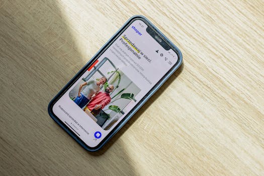
SEO Benefits: Google Rewards Mobile-Friendly Sites
Search engine optimisation and responsive design go hand in hand. Google updated its search algorithms in 2015 to rank responsive websites higher than non-responsive ones. Since then, Google has moved to mobile-first indexing, meaning the mobile version of your site is the primary version that influences rankings. If your site is not responsive, you risk dropping in search results. Responsive pages also tend to load faster because they use a single set of resources, and faster page speed is another ranking factor. Combined, these advantages give responsive sites a clear SEO edge. Better rankings mean more visibility, more organic traffic, and more opportunities to convert visitors.
Cost Efficiency and Simplified Maintenance
Building and maintaining two separate sites – one for desktop and one for mobile – is expensive and time-consuming. Responsive web design eliminates this by using a single website for all devices. Development costs are lower because you only build one site. Maintenance is simpler because any updates or changes are made once and apply everywhere. Over time, this saves significant time and money. There is also the benefit of easier analytics reporting. With a single URL structure, you do not have to track separate desktop and mobile analytics; all traffic funnels through one set of pages, making it simpler to understand user behaviour and measure performance.
Responsive vs Adaptive vs Separate Mobile Sites
It is worth understanding how responsive design compares to other approaches so you can make an informed decision. Two common alternatives are adaptive web design and maintaining a separate mobile site.
Approach How it works Pros Cons Responsive design Uses fluid grids and percentages to adapt to any screen size Works on all devices; less maintenance; future-proof as new devices emerge Can be slower if high-resolution images are not optimised; navigation can be tricky on very small screens Adaptive design Uses a set of fixed templates for specific screen sizes (usually around six) More control over layout for each breakpoint More work to create and maintain templates; may not cover every device size Separate mobile site Two distinct websites – one for desktop, one for mobile (often on a subdomain like m.example.com) Can be highly optimised for mobile users Higher development and maintenance costs; duplicate content issues; requires redirectsFor most businesses, responsive web design offers the best balance of performance, cost, and future-proofing. You avoid the extra work of multiple templates and the expense of a second site, while ensuring visitors get a consistent experience no matter what device they use.

Conversion Rates and Bounce Rates
Two metrics every business cares about are conversion rate and bounce rate. Responsive web design positively affects both. When a site is easy to use on a phone, visitors are more likely to complete a purchase, fill in a form, or contact you. Higher conversion rates mean more revenue from the same amount of traffic. At the same time, a good mobile experience reduces bounce rates – the percentage of people who leave after viewing only one page. If your site loads poorly or requires zooming, people leave quickly. Responsive design keeps them engaged longer, which signals to Google that your site is valuable.
Challenges to Consider
Responsive web design is not without its drawbacks. One potential downside is slower page loading due to high-resolution images if they are not properly optimised. You need to ensure images are served at appropriate sizes for different devices. Navigation can also become difficult on very small screens if menus are not designed carefully. Additionally, the initial development time can be longer than building a single fixed-width site because of the extra testing and adjustments needed. However, these challenges are manageable with good planning and a skilled development team. The long-term benefits – better user experience, SEO, and cost savings – far outweigh the initial effort.

Making the Switch
If your current website is not responsive, it is time to consider an upgrade. The statistics are clear: around 60% of global web traffic comes from mobile phones, and Google uses mobile-first indexing. A non-responsive site risks losing visitors, rankings, and revenue. Whether you are building a new site or redesigning an existing one, responsive design should be the standard. At Bonsai Digital, we help businesses shape online experiences that work across every device. If you are ready to make your site work harder for your business, get in touch to see how we can help.
Frequently Asked Questions
Does responsive web design improve SEO rankings?
Yes. Google has used mobile-friendliness as a ranking signal since 2015, and now uses mobile-first indexing. Faster load times and a single URL structure also support better SEO performance. Responsive sites are easier for Google to crawl and index, which can help improve your search visibility.
Is responsive design more expensive than a separate mobile site?
No. A responsive site costs less to develop than two separate sites because you build one website for all devices. Maintenance is also cheaper and simpler, since updates are applied once rather than duplicated. Over the long term, responsive design saves money.
Can responsive design work for an existing website?
Yes, but it often requires a redesign. You can retrofit an existing site by changing the layout to use fluid grids and media queries, but the effort may be comparable to building from scratch. A professional developer can assess your current site and recommend the best approach.
What are the main disadvantages of responsive web design?
Potential disadvantages include slower loading if images are not optimised, navigation challenges on very small screens, and a longer initial development time compared to a fixed-width site. These issues can be resolved with careful design and optimisation.
How do I know if my website is responsive?
Open your site on a phone or tablet. If text is readable without zooming, buttons are easy to tap, and the layout adjusts naturally, it is likely responsive. You can also use Google’s Mobile-Friendly Test tool to check. If your site is not responsive, it is time to plan an update.